3 golden rules for dashboard efficiency
By Maxime de Jabrun.
How many people are reading your dashboard? Do they catch the key messages? Are your KPIs accurate? Is it action oriented?
It is easy to report that 4 work stations have been infected by a virus. But what does it mean?
So here are 3 golden rules that you can apply to improve the usefulness, usability and use of your dashboard.
Rule # 1 – Provide meaning with your KPI
Each indicator shall inform: current value, target/threshold value, trend, related initiative to improve value.
Rule #2 – Ease readability of dashboard
Weather report signs (ðÛ~), traffic lights signs (½½) or smileys (JKL) have in common that you need to focus your brain to understand the meaning of the symbol.
When you review a dashboard comprising of dozens of lines and columns (yes you may have this bad practice in place), you need to focus fast on what is important: “what’s at risk?”
Forget old school symbols and replace them by: ¡ – under control, n – at risk, n – to be dealt with urgently. Just try it!
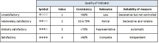
Rule #3 – Assess the quality of your KPI
The readers of the dashboard shall determine their critical requirements. You then define indicators to report compliance to these requirements.
In the real world, it is not that easy. Indicator collection can be costly.
It is important to provide quickly a stabilized version of your dashboard and to provide a roadmap to improve the quality of your metrics.
Quality can be assessed according three criteria:
- Consistency – The measure is consistent on the whole scope (countries, server technologies, users, business units);
- Relevance – Indicator is representative of the objective / critical requirement;
- Reliability – Guarantee that the given value matches reality.
Derniers articles
- Réseaux sociaux et connaissance client

- Analyse des solutions de sécurité réseau et leur complémentarité

- Bonnes pratiques de sécurité des voyages

- ISO 27001 et ISO 27002, une nouvelle version majeure pour des changements majeurs

- DEEPFAKE : Le nouveau casse-tête des méthodes d’authentification